
Your bike computer is only as useful as the data you choose to show on it. The options and customization on modern head units are great but setting them up can be overwhelming. Too many fields and you're squinting at a spreadsheet while trying to hold a wheel. Too few and you're riding blind. The four screens on my Hammerhead Karoo represent years of adapting and updating, and this is where I have settled. Each field earns its place, and none of it is there by accident (ok maybe I have a couple odd ones). Let's walk through them.

A Cockpit Tour: What's on My Bike Computer and Why?
Coach Noah Granigan
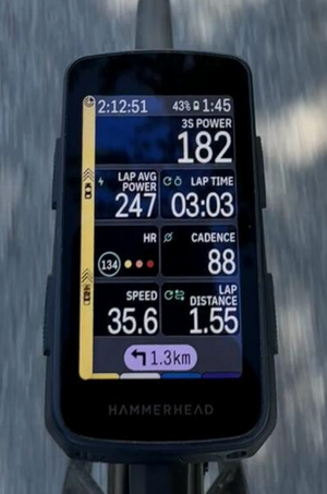
Screen 1: Main Ride Screen — Full Data Dashboard
When I use it: Training rides, structured intervals, most of a race
This is the workhorse screen that's up the vast majority of the time. Seven fields organized to give you an instant, complete picture of what's happening right now and how the current effort is tracking.
Notice the hierarchy: current power is top-right and largest. That's intentional. Everything else provides context around it. Lap power and lap time are for tracking efforts through a workout, with the lap button starting and ending each effort. Heart rate shows how your body is reacting to the effort and cadence data is available for high-torque efforts or high leg-speed work.
The left-hand strip is the radar display to give an extra layer of protection on open roads. It's a meaningful safety tool that lets you stay heads-up without constantly looking over your shoulder.
Data Fields
3S POWER: Your primary effort signal shown large at the top. A 3-second rolling average is the sweet spot: responsive enough to reflect your actual output, stable enough to act on without chasing every fluctuation.
LAP AVERAGE POWER: Tells you whether your effort is tracking where it needs to be for the effort or segment. Drifting below target? You know immediately. This prevents the classic mistake of going out too hard and fading before the effort is done.
LAP TIME: Paired with lap average power, it gives you a sense of how much of the effort has elapsed. On a structured workout, this is essential.
HEART RATE HR: Confirms whether what you're doing is actually as hard as the power suggests, or vice versa. How is your body reacting to the power?
CADENCE: The cadence of your natural leg speed will likely be found when pushing hard, but it’s good to have the measurement available for any cadence-specific workouts.
SPEED: Situational awareness for riding in groups or just knowing how fast conditions and terrain are translating to ground speed. On flat roads it's a quick gut-check against power output.
LAP DISTANCE: This one is for distance-based races where I’m not following a route. I can get my warmup, race, and cool down onto one .fit file to make everything simple, and zero out the distance on the start line so I can gauge the race length.
The best bike computer setup isn't the one with the most fields. It's the one that answers your most important question in under a second, every time you glance down.
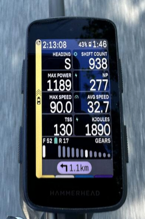
Screen 2: Cumulative Stats Screen -The Big Picture
When I use it: Post-ride analysis, mid-ride quick checks
This screen answers a different set of questions: not "what am I doing right now" but "what has this ride amounted to." It's where you check in on key metrics like Normalized Power, kilojoules, or TSS that are extremely valuable but offer less mid-ride value.
These fields live on a dedicated screen because you don't need to look at them every minute, but when you do want them, you want them all in one place.
Data Fields
NORMALISED POWER (NP): The most honest measure of how demanding a variable-effort ride has been. NP accounts for the physiological cost of surges and recoveries. Significantly higher than average power means the ride was more taxing than the raw average lets on.
MAX POWER: This one is fun during a sprint workout or after racing a buddy to the town-line. A quick check for the 1second max without waiting for the TrainingPeaks upload. Little actual training value but good for motivation see if you can one-up yourself during the sprint workout.
TSS (TRAINING STRESS SCORE): The best overall measurement of accumulated load. It’s not massively useful mid-ride other than a quick sanity check on fatigue level.
KILOJOULES: A direct measure of mechanical work done. Since kJ maps closely to Calories burned, it's an invaluable on-the-fly fueling reference.
AVG & MAX SPEED: There are so many variables that go into both of these metrics, that they’re mostly useful when comparing to the same ride in the past. It can be fun to do a quick check of these numbers for a good speed context of any ride.
SHIFT COUNT: Admittedly, this is one I haven't fully figured out how to act on yet, but it's a fascinating statistic. The real value is post-ride if you connect your drivetrain to your head unit: your drivetrain software can show time spent in each gear, which over time can guide smarter decisions about chainring and cassette sizing for your specific riding terrain.
GEAR DISPLAY: Primarily here to show drivetrain battery level which is essential for electronic groupsets on long rides. It’s good to know if you’re running low so you can anticipate the drop.
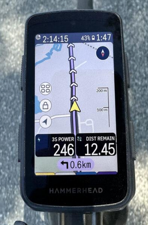
Screen 3: Navigation Screen - Map + Minimal Data
When I use it: Race-day, gravel & MTB marathons, unfamiliar courses
This screen shines on race day, especially in gravel and MTB marathon events where knowing where the hell you’re going is the most important data point you could possibly have. When you're navigating terrain you've never ridden, a wall of numbers is the last thing you need.
Course knowledge changes how you ride, and automatic climb detection in modern head units is incredible. Knowing a big climb is coming in 4 km means you can try to conserve energy now. Knowing you're 12 km from the finish means you can start calculating what you have left to give. The map and the distance remaining field work together to make those decisions automatic.
The two data fields kept here are all you need for a quick sanity check. One tells you your current effort, the other tells you how much of the task remains. Everything else is noise when your eyes need to be on the trail.
Data Fields
3S POWER: Your primary effort signal shown large at the top. A 3-second rolling average is the sweet spot: responsive enough to reflect your actual output, stable enough to act on without chasing every fluctuation.
DISTANCE REMAINING: On a race or event, this is the single most useful pacing reference on the screen. It anchors every effort decision you make, and on a gravel marathon, knowing how far you still have to go is the information that shapes how hard you can actually push.
TURN-BY-TURN BANNER: Always visible at the bottom of the screen, with distance to the next turn. Enough advance notice to gauge how the wind is about the change or simply not miss a turn while you’re in the middle of nowhere (most gravel races).
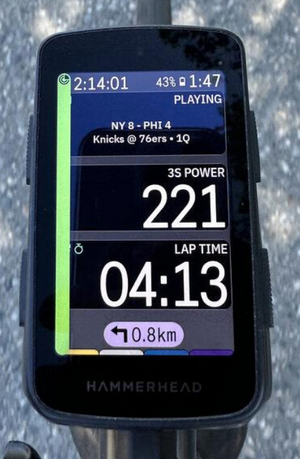
Screen 4: The Audio Focused Screen
When I use it: Long fall endurance days, Sunday football season
Okay, this one started as a joke. I noticed the Karoo had a new audio detail widget, thought "that's ridiculous," set it up anyway, and then proceeded to use it while listening to any sports game on Sirius XM.
Being an Eagles fan in Colorado is tough, there are a lot of 11am MST games, and it can be tricky to knock out a 4 hour Sunday endurance ride without riding during the game in the fall. Luckily, the audio widget sends data from your phone to the computer and you can check the score, game clock, and possession at a glance while listening to the radio call. (Sixers game 4 loss shown here for demo purposes).
This could also show whichever song, podcast, or show you’re playing on your phone and you can even add volume buttons onto the screen if you want.
Data Fields
AUDIO WIDGET: Genuinely the best feature on this screen and arguably the best feature on the Karoo for long fall endurance days. The score and game clock updates live, you've got the broadcast in your ears, and suddenly a four-hour zone 2 ride becomes game day. Highly recommended. Zero regrets.
3S POWER: Still here, still important. The beauty of a simple screen is that when you do glance down, the number is impossible to miss.
LAP TIME: Loose structure for a free-form endurance ride. Useful for tracking how long you've been in a segment without adding any pressure. On a simple workout, it's all the timing you need.
The Philosophy Behind the Setup
Every field on every screen answers a specific question, and each screen is designed for a specific context. The main ride screen gives you complete real-time feedback. The stats screen zooms out to the bigger picture. The navigation screen keeps your eyes on the course. And the audio focused screen gets out of the way entirely, because sometimes the best training tool is something to keep your mind occupied for long endurance days.
The common thread is intentionality. Before adding a field, ask yourself: will I actually act on this information? If the answer is "probably not," leave it out. White space on a bike computer is not wasted space, it's clarity.
If you'd like help setting up your own data screens around your training goals, reach out to the team at Boundless Coaching. The numbers you show yourself on every ride shape the habits you build and it's worth getting them right.
-Boundless Coach Noah Granigan
May 27, 2026